Todmorden

Instinctively, updating a map feels like it should be an easier and smaller job than creating a new map, but that's often not quite how it turns out. I've heard good mappers say that if they're asked to update a map, they will actually start from scratch instead. The reason is a really bad map can be worse than no map at all.
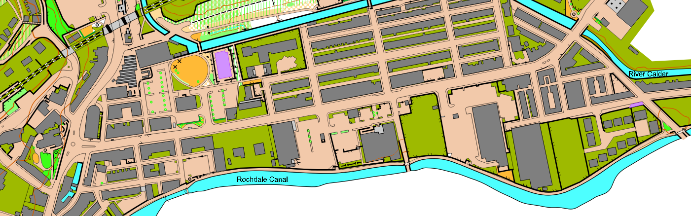
When I was asked to update the Todmorden map by Pendle Forest Orienteers (PFO), I worked with the existing map because the area is big (1.5 km², roughly A3 at 1:5,000, even bigger at 1:4,000) meaning that making a new map would involve a long time tediously drawing the base map. In the end, this was the right choice, drawing the base map alone would have taken longer than the entire process of updating. However, I was soon to be keenly aware of the annoyances of updates.
Untidy maps.
Most of the time, this untidiness is nigh-on invisible to a runner during competition, it's only when you sit down with the map afterwards, or really zoom in on a screen, that you notice it. It gives the impression of a rushed and poor-quality job, not something a mapper wants to get a reputation for.
The desire to tidy up all of these little imperfections is insatiable, and whilst I spent many hours on it, on a map with roughly 1000 buildings I know there will be many little bits I'll have missed. I hope I've caught all the bigger ones, especially any that make the map ambiguous, but it still nags that someone could pick up the map, see some untidiness, and attribute it to me.
The next major part of updating is adding all the new building developments. For this map that includes a new Lidl, Aldi, 2 new housing estates, a demolished retirement home and a new primary school. For these, I used the OS MasterMap and drew a "base" in the same way as a new map, then went and field-checked as usual.
Another important part of updating a map is improving sections of map which haven't changed on the ground, but where the map needs bringing in line with current best practice in terms of the specification, ISSprOM 2019-2, and style. For example, the tunnels under the railway:
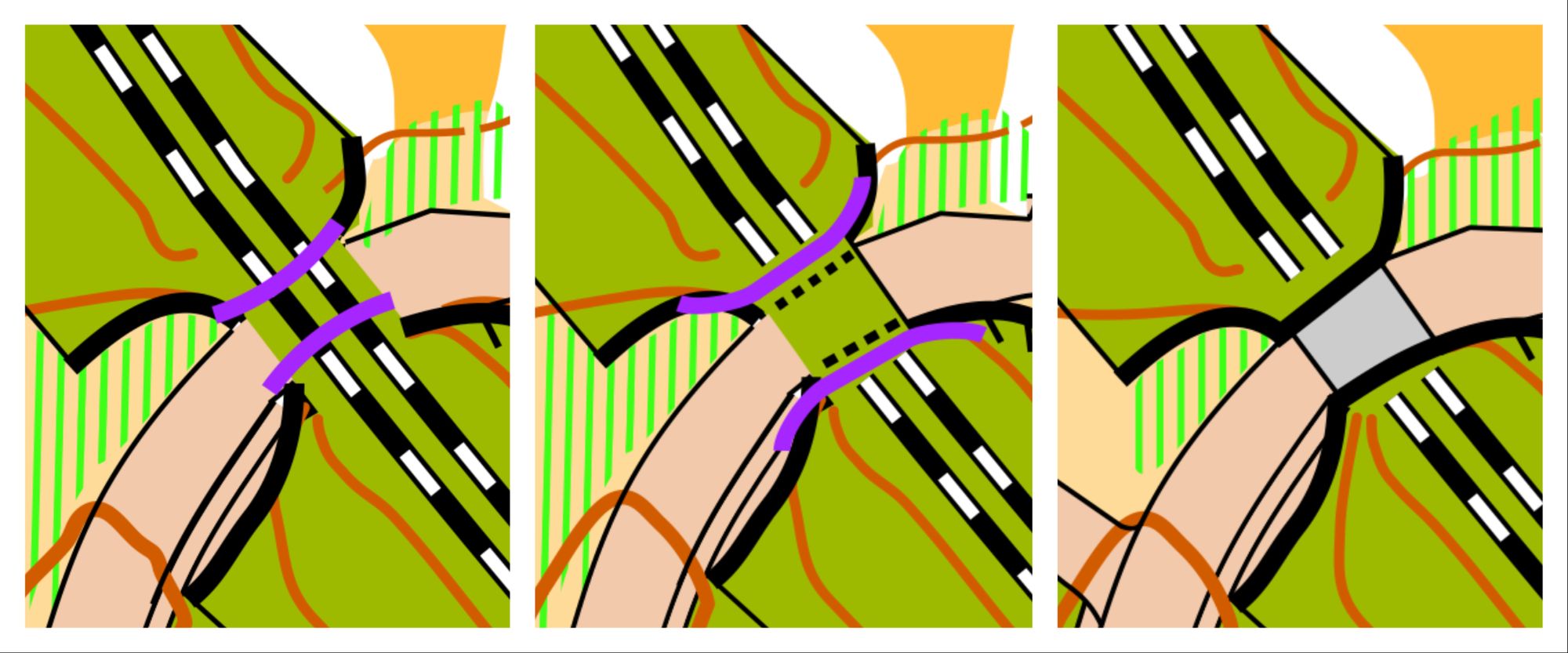
The original map is terrible, with only a small purple crossing point symbol to show you can get through. Here, the relevant bit of ISSprOM is the principle that "the main running level should be represented." In this case, you cannot run on the railway on the upper level, so there is only one running level, underneath the bridge. Therefore I decided the canopy symbol was the best choice. The fact that it is a railway on top of the bridge is irrelevant to the runner. I think the new depiction makes it much clearer that you can get through.
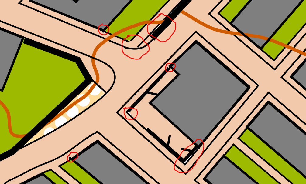
A more complicated feature to map was a tunnel, again under the railway, but also partly underneath land you could run on:
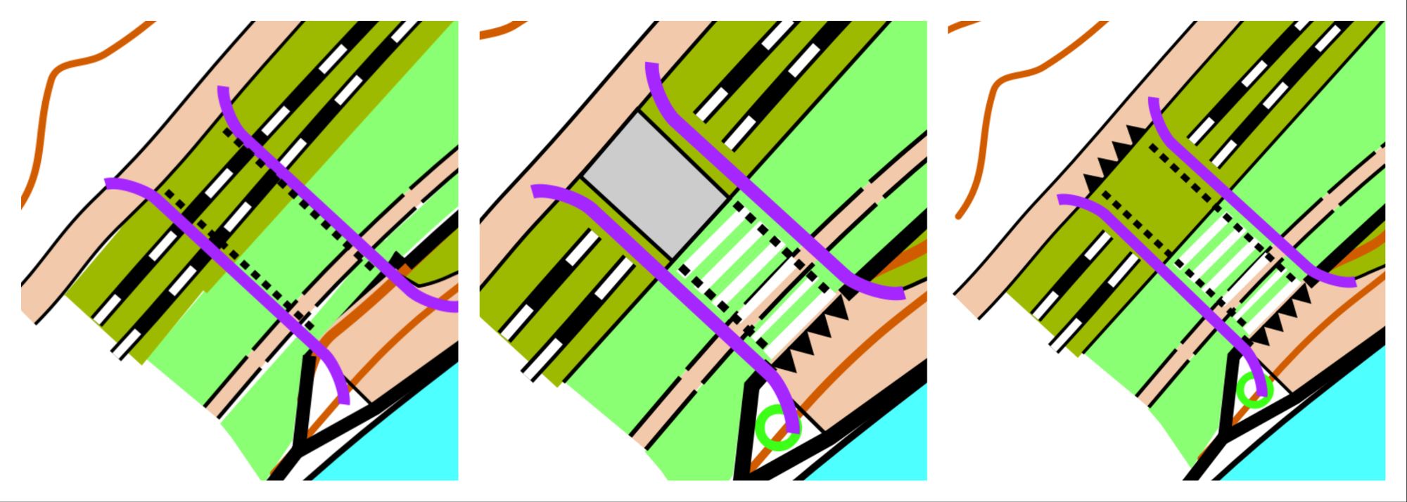
Firstly, same as before, breaking the railway lines makes it clearer. Next, the latest ISSprOM has a special symbol for areas where you can run on both the upper and lower levels - diagonal stripes of white and the colour of the upper level. Along with this, the entrances and exits of underpasses should have black triangles. Following the same logic as for the first underpass, we come to the central option above, which I think you could argue is the correct way of representing it. However, I thought that the right-hand option made it clearer that it was one connected tunnel, with the triangles at both ends. Since it is still a complicated feature, ISSprOM says that the purple crossing section symbol be kept, if it is to be used in competition.
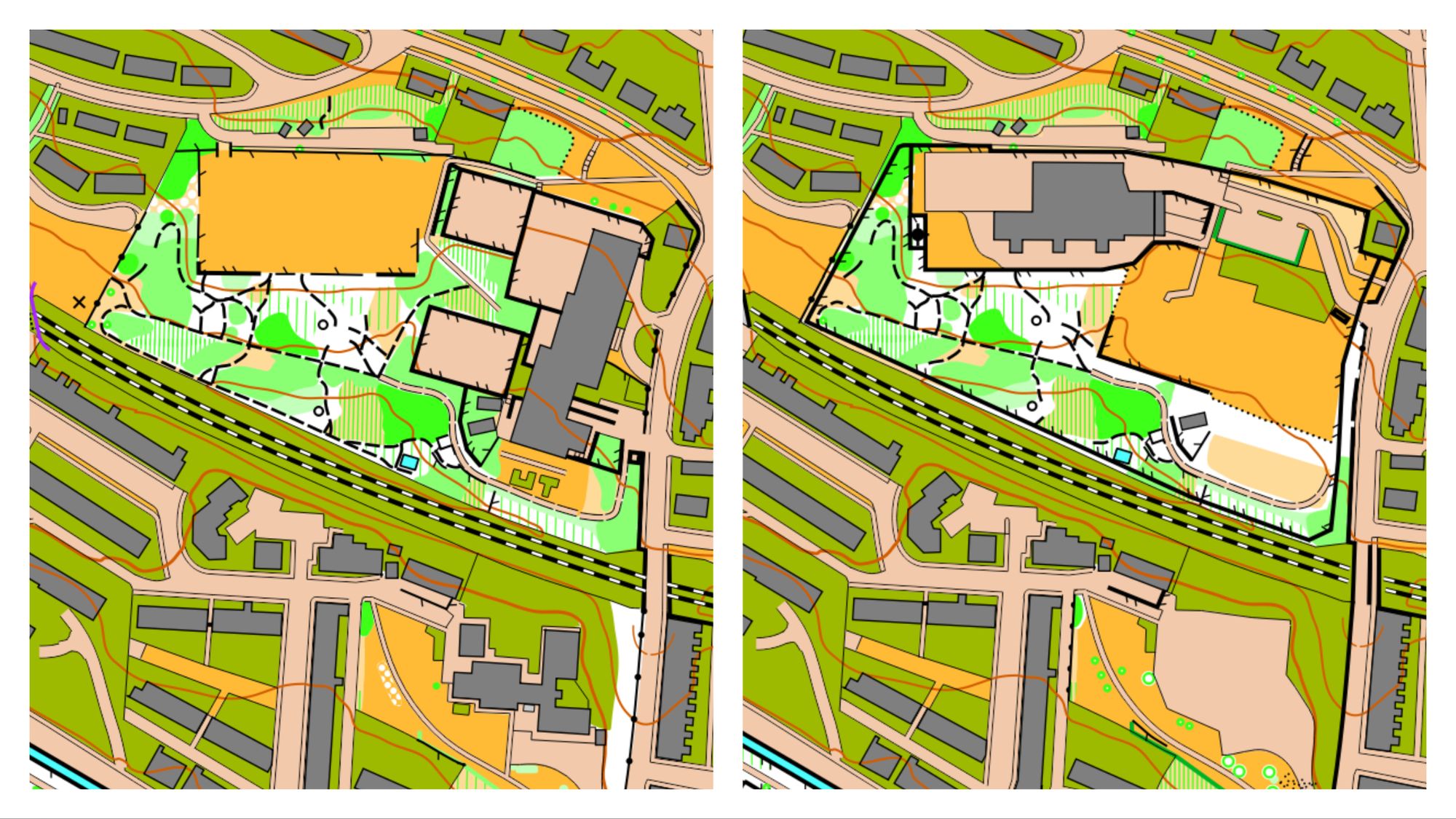
And finally, here's a fun feature I came across, which hadn't been included on the old map:
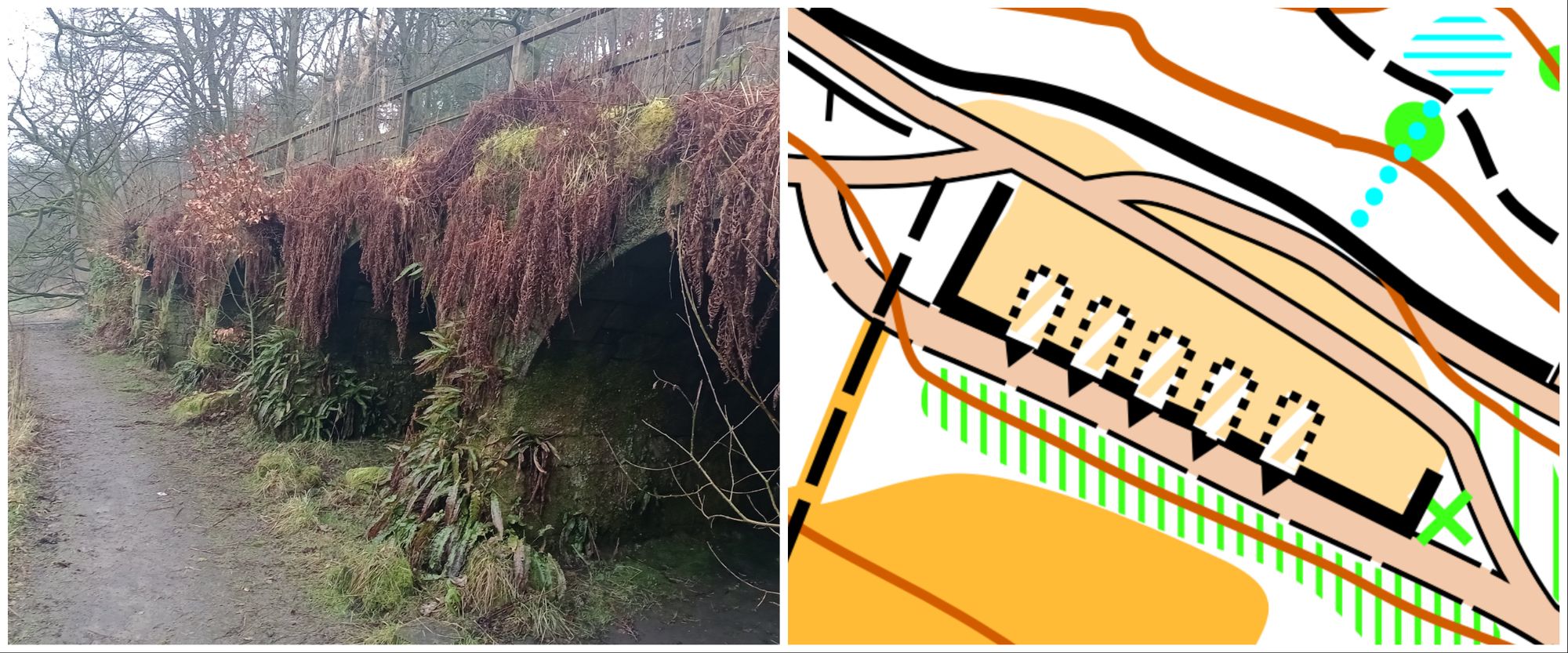
You can run into the archways, but they are dead-ends. Above them is a patch of rough grass which you can run across. I think they could make quite fun control sites.
Todmorden is hopefully going to be used for a full-length Urban event in May I believe, which may well be the first time people run an event on one of the maps I have worked on!
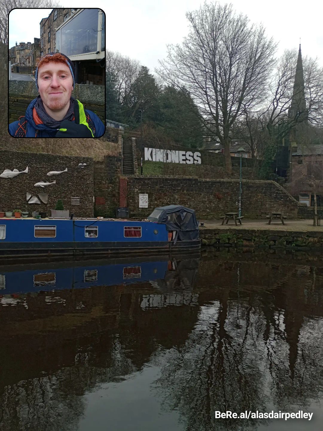
Thanks for reading! Here's me doing my fieldwork, with one of the "Kindness" signs that are dotted around the town. It is in Happy Valley territory after all.