Bughtlin and Dalkeith

It's hard to believe I made my first urban map 12 months ago - Corporation Park, which coincidentally PFO are finally using for an event in two weeks' time. Since then I think the count is ten, plus a few more half-finished ones. Five of those have been in Edinburgh, as EUOC had ambitious plans for their training week alongside Big Weekend. It was very fun to see international runners running on my maps and saying they enjoyed it on Strava.
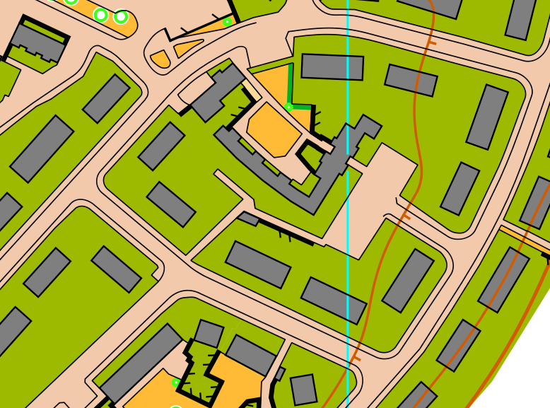
First was Leith Docks, last March, followed by Bughtlin (pronounced Bewt-lin) last July/August. When I was mapping it, I didn't actually know the plan was to use it for the Sunday of Big Weekend! It's an intricate area, with plenty of narrow passages where I had to be careful to maintain a minimum width, but beyond that the process wasn't any different to other urban areas so I won't talk about it too much here. I've written quite a few posts about that, for example Poltonhall.
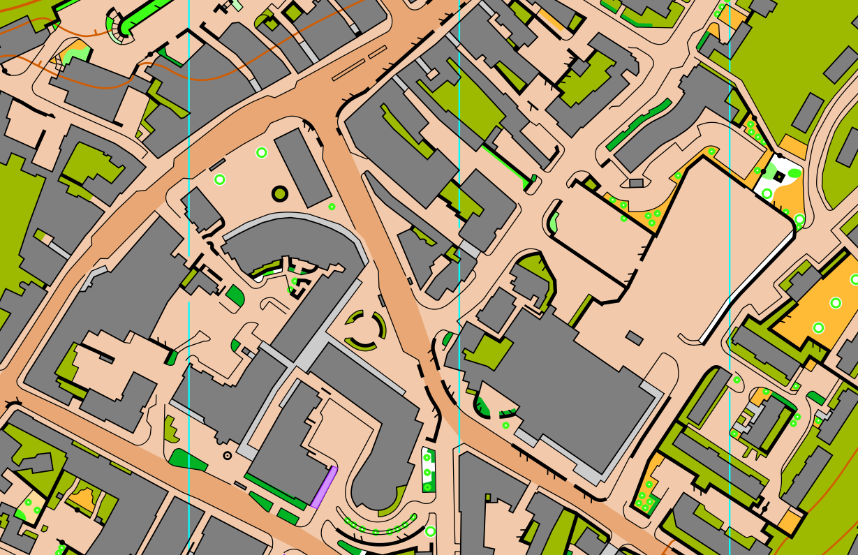
One thing I thought it would be good to talk briefly about here is how my maps have subtly changed over the last 9 months or so. Here's an excerpt of Bughtlin:
Whilst on the whole, I was happy with the map, there are certain things I would have done differently when looking back:
- Too much detail on the buildings. I didn't autogenerate them, I drew them by hand, but I have no idea why I included people's extensions and conservatories. It was GG who enlightened me that I could just simplify the majority of them to rectangles. It saves time, too.
- Passable fences bordering olive green. When I did it, I was thinking they added something of value, with a thin black line meaning no boundary between the pavement and the lawn/garden, but looking back I think I had too much of a zoomed-in view. The general consensus is they are unnecessary clutter, and a thin black line is fine. That seems to be supported by previous WOC maps too.
- Not taking care over the colour table. In the extract, you can see the contours are above the outlines of the buildings and the pavement edges, which is wrong. Recently I've been using the WOC 2024 Sprint Manual to check my colours against. It's also a very useful document for other things about sprint courses.
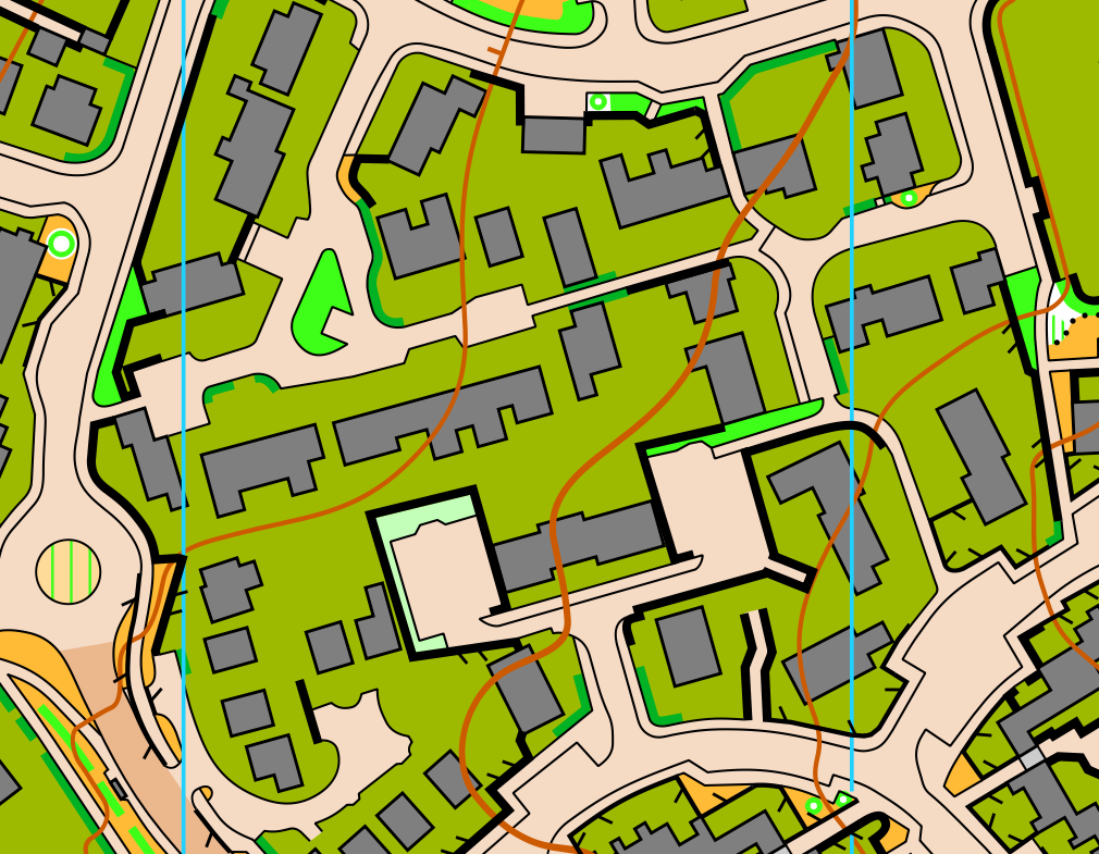
Here's an extract from a housing estate on the Dalkeith map, which hopefully illustrates the three points above.
I've also put tag lines on my contours! All this goes to show there is usually room for improvement even when you think you've made a decent map. I'm trying to keep an open mind and not get set in my ways.
The Bughtlin map is on EUOC's Routegadget (not quite the full extent of the map - there's a really complex bit in the south but it's a bit too borderline private for such a big event).
Next urban map in the queue will be in Glenrothes for Sprint Scotland. As well as organising that I'm organising and planning the first SOL of the year in Kintyre. I'll try my best to find time to write about that. It's full steam ahead with WOC too - that will have to be a whole series of posts once it is done!